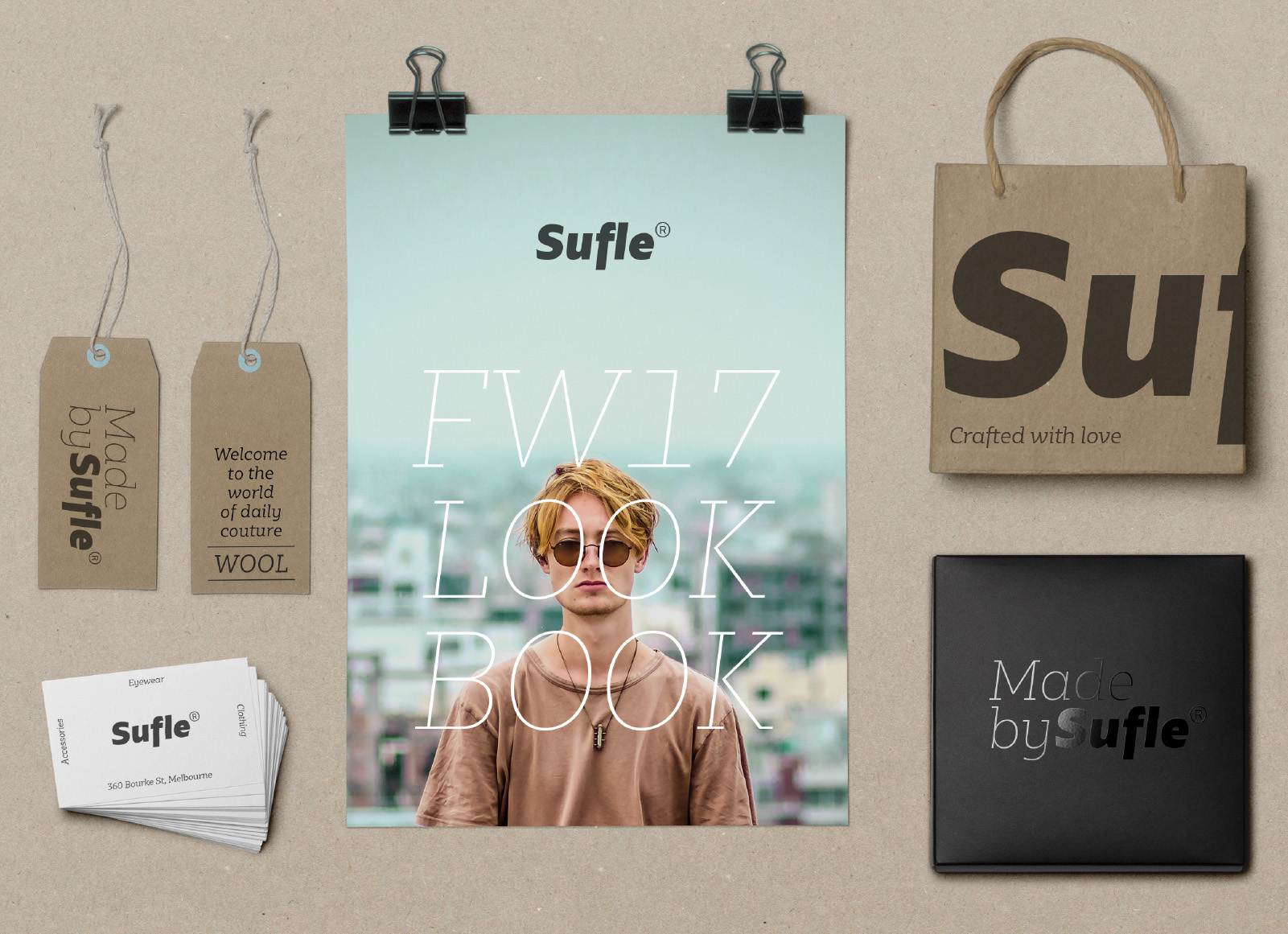
Miscelanea
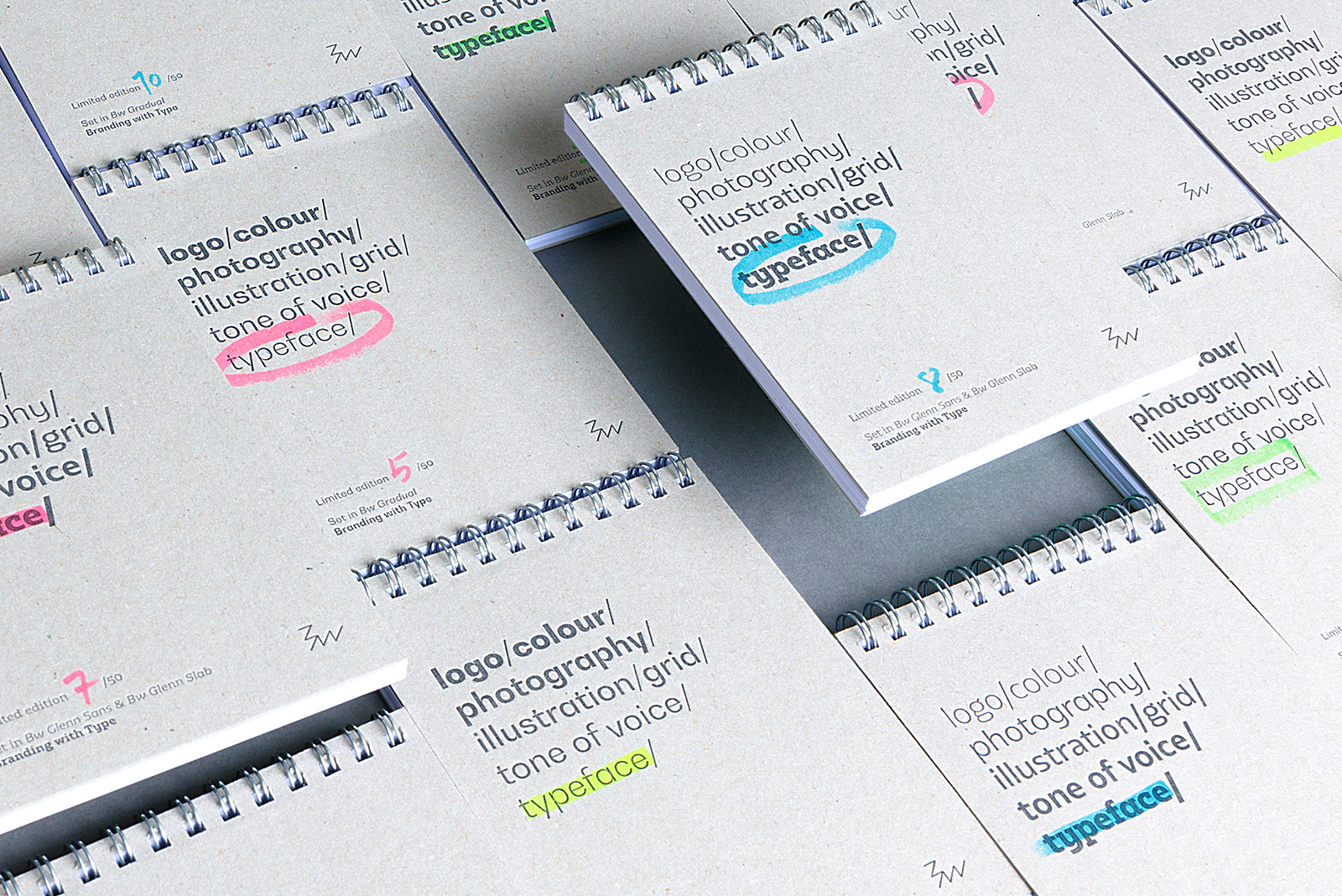
G is for fonts & letterpress notepads


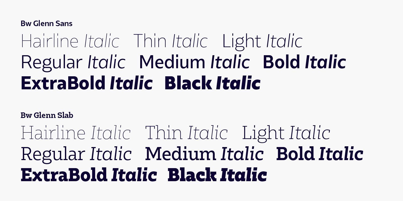
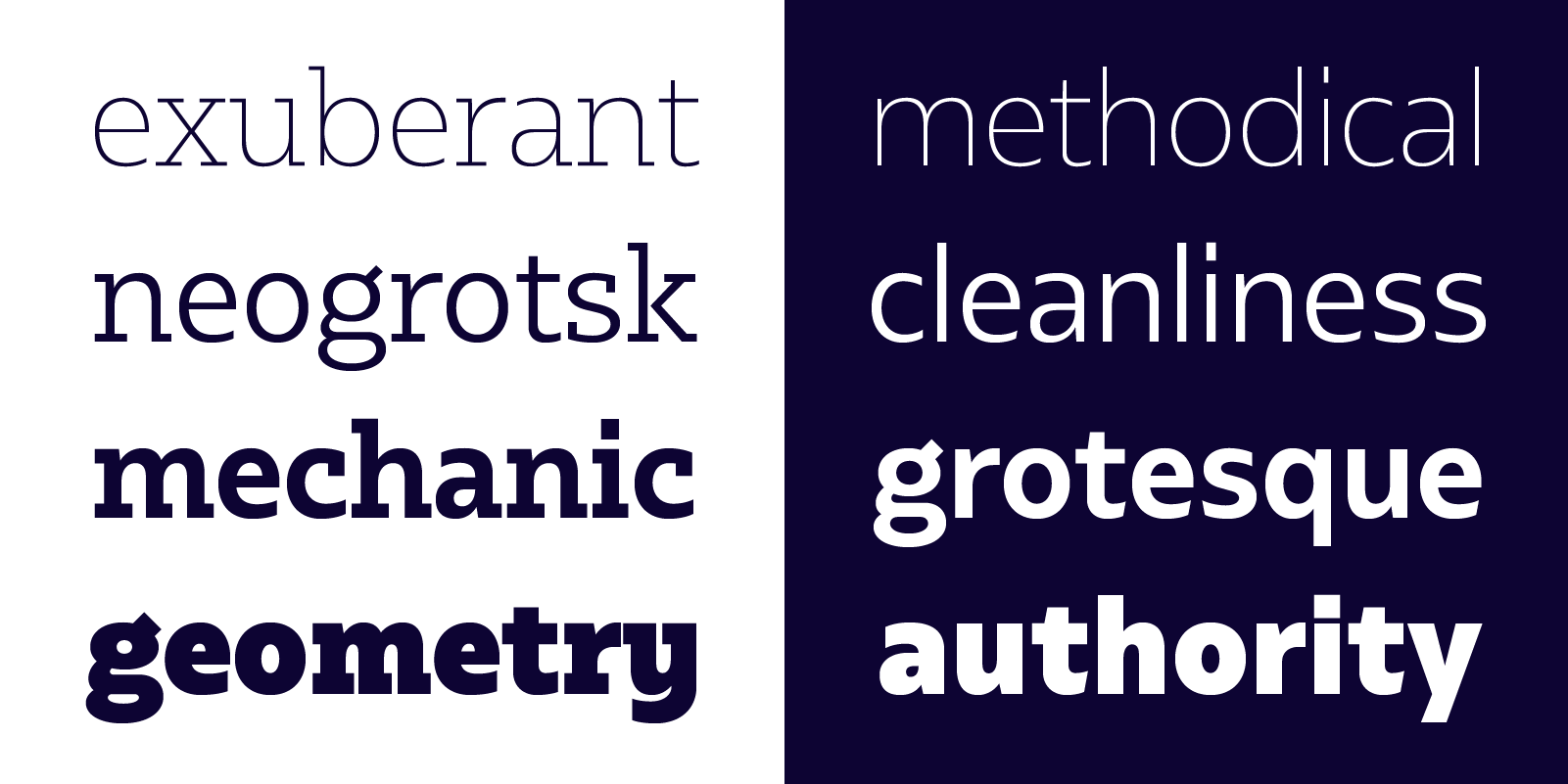
The Bw Glenn Collection is formed by two stand-alone subfamilies: Bw Glenn Slab and it’s grotesque companion Bw Glenn Sans. They’re the perfect complement for each other, sharing x-height and modulation as both font families were developed in parallel.
Bw Glenn Sans is the result of mixing a grotesque skeleton with traits of the British sans serif tradition. The result is a modern and clean sans serif family that speaks with clarity and authority. Its contained width makes it a favourite for long texts while its distinctive details come to life when used as display.
Bw Glenn Slab is a confident and robust font family with a sturdy feel offering no concessions for ambiguity. Its strict geometry and open shapes provide a very legible and clean texture, performing well on print and screens alike.
Designed by Alberto Romanos, each subfamily comes available in 8 weights from Hairline to Black with matching italics, tabular and old style figures, case sensitive forms and many other OpenType features. The Bw Glenn Collection supports Extended Latin, providing designers worldwide with a rich functional palette with that extra bit of personality.