New font release
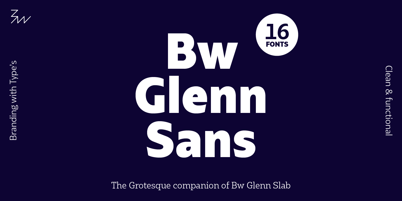
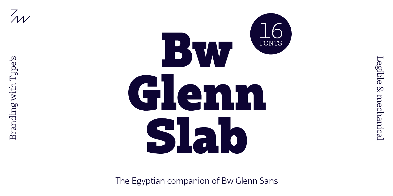
Bw Glenn Slab & Bw Glenn Sans
We kick off 2017 introducing two new font families, the siblings Bw Glenn Sans and Bw Glenn Slab.
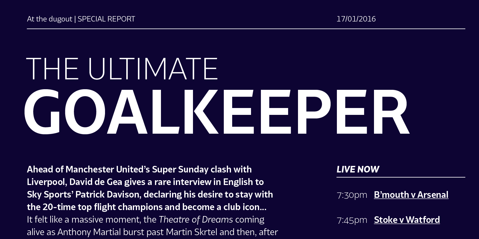
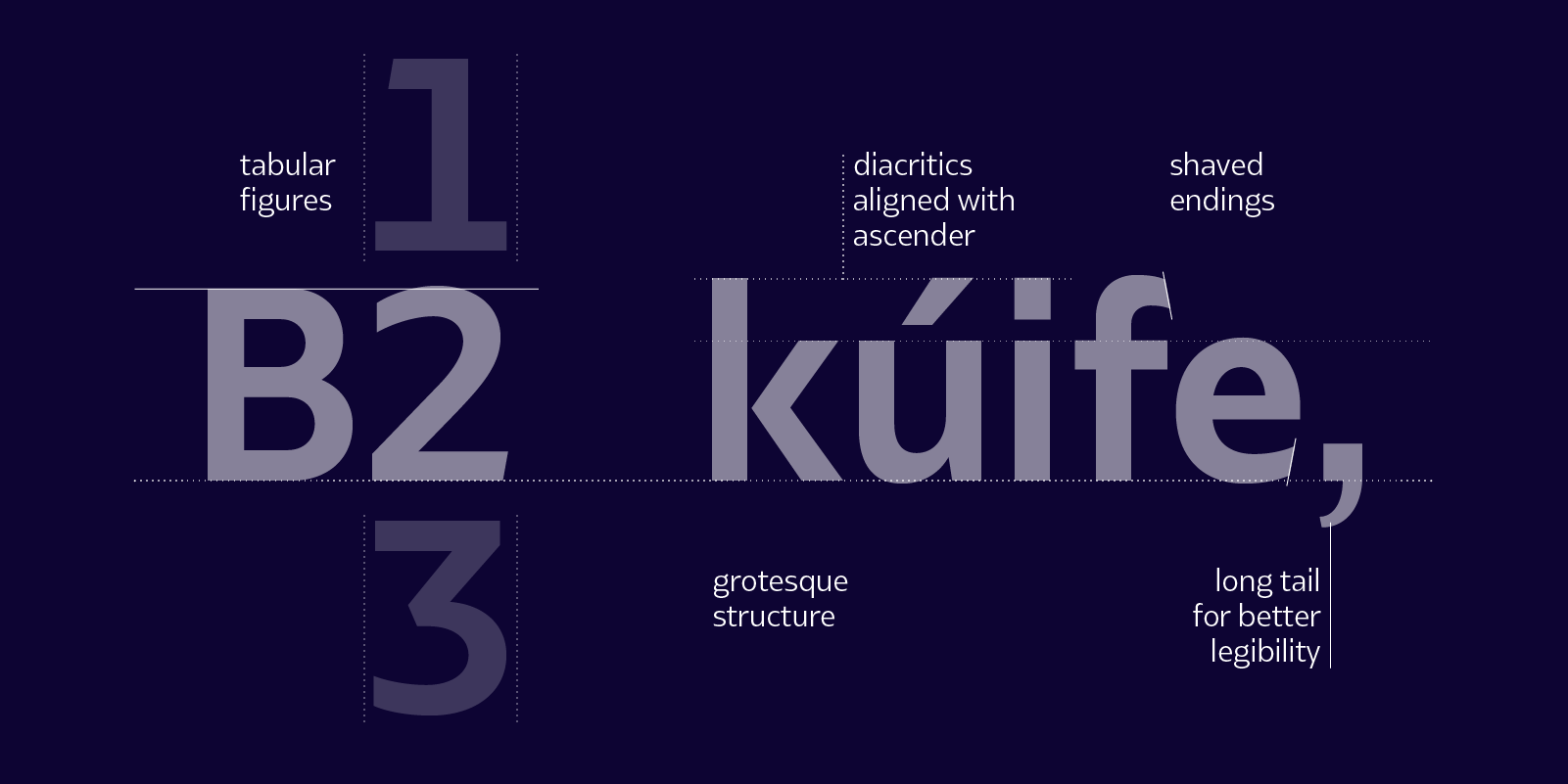
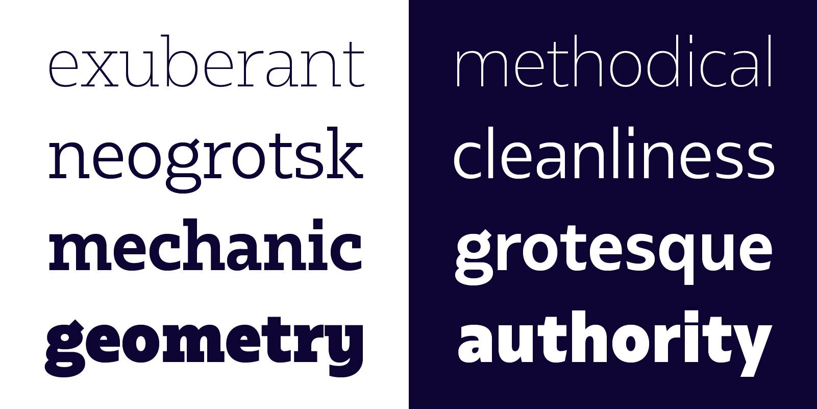
Bw Glenn Sans is the result of mixing a grotesque skeleton with humanist traits of the British sans serif tradition. The result is a modern and clean sans serif family that speaks with clarity and authority. Its contained width makes it a favourite for long texts while its distinctive details come to life when used as display.
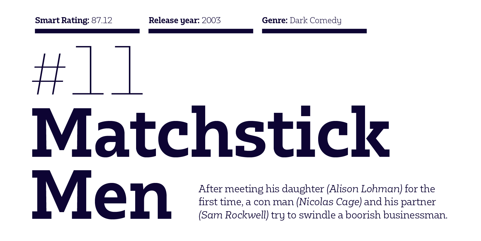
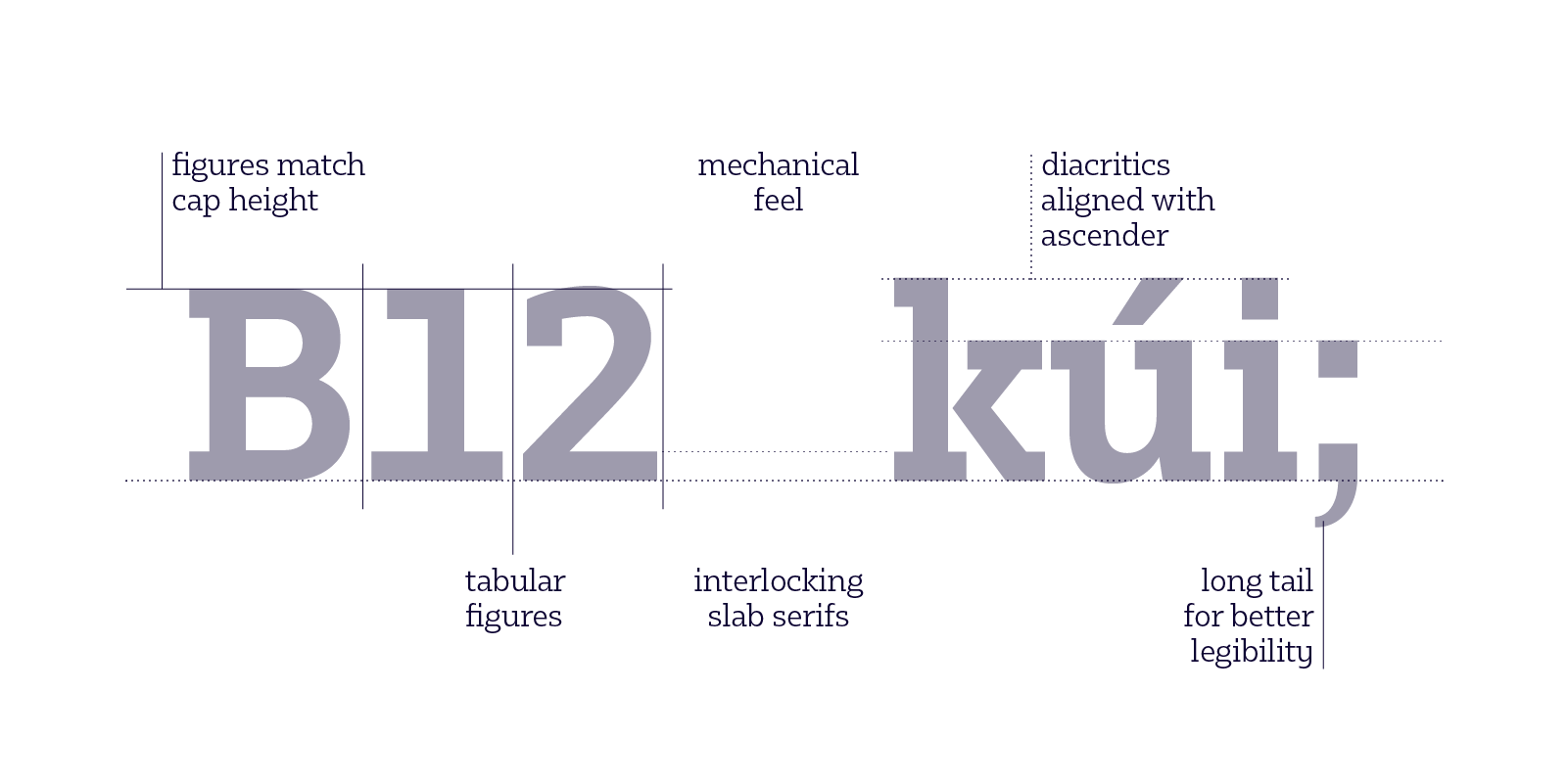
Bw Glenn Slab is a confident and robust font family with a sturdy feel offering no concessions for ambiguity. Its strict geometry and open shapes provide a very legible and clean texture, performing well on print and screens alike.
They’re the perfect companion for each other, sharing x-height and modulation as both font families were developed in parallel.
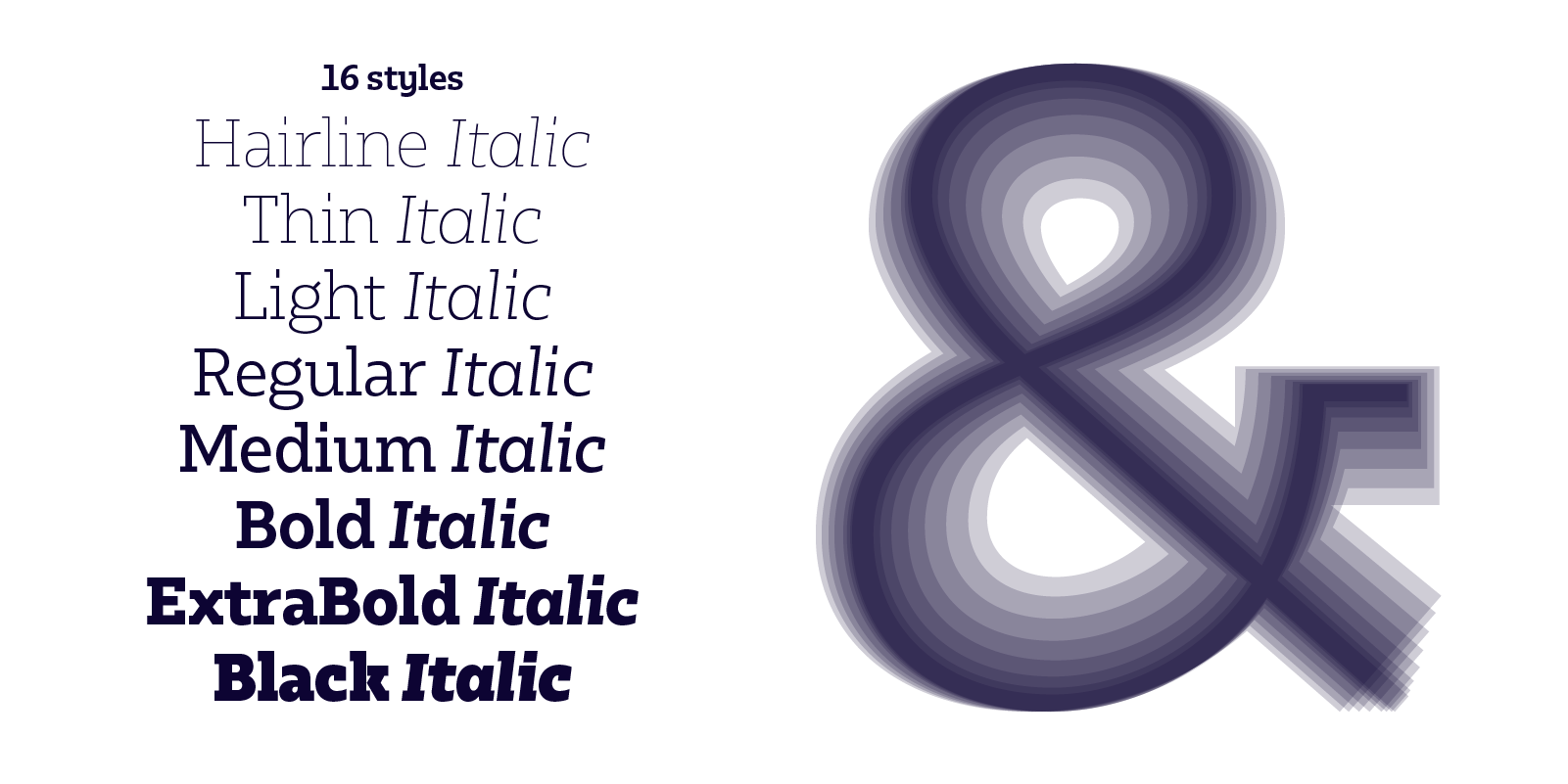
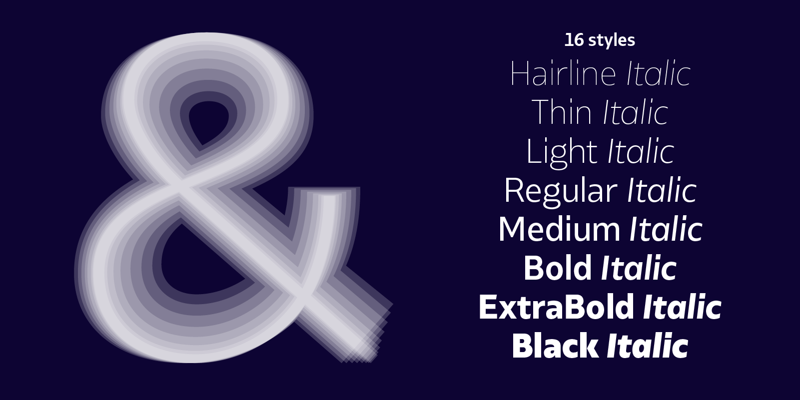
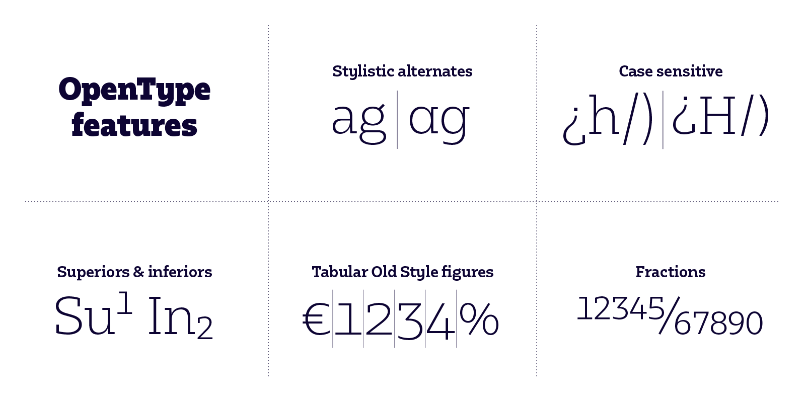
Designed by Alberto Romanos, both families are available in 8 weights from Hairline to Black with matching italics, tabular and old style figures, case sensitive forms and many other OpenType features. They supports Extended Latin, providing designers worldwide with a rich functional palette with that extra bit of personality.