Interview
The traditional font licensing model leaves the door open to criminalising your clients, which I find appalling
Original interview by Ana Moliz for Graffica, published in Spanish on February 2025.
Branding with Type is a type foundry founded by Alberto Romanos in 2014. In recent years, it has consolidated its presence in the industry with a clear focus on functionality and, as its name suggests, brand identity.
Recently, they’ve implemented a series of significant changes aimed at maintaining a strong presence in a shifting and competitive market. To this end, they've revamped their website and, above all, updated their font licensing model, seeking greater simplicity for users.
At the same time, they have worked on large-scale projects, such as custom fonts for Manchester City or UEFA Champions League.
This interview with Alberto dwells into his philosophy, his creative processes and his vision for the future of the typographic market.
What has been the philosophy of Branding with Type since its inception, and how has it evolved over time?
I started Branding with Type after many years as a graphic designer, primarily working on visual identity projects. My goal back then was to design typefaces that I would want to use for a brand and that would be easy to license, without arbitrary restrictions.
Nowadays, I don’t use typefaces that often anymore; I only use my own fonts when testing them while designing and when producing the visuals for the specimen, but the philosophy remains similar. The goal is to design typefaces that have that extra bit of personality so other designers will want to use them in branding projects. The “no-nonsense licensing” part is still as valid as it was on day one.
Aviva Curve. Bespoke typeface for Aviva. Agency: Landor.
If you had to highlight a distinctive feature of your typographic designs, what would it be?
For lack of a better word, I want them to be contemporary, from today, not from 50, 100, or 300 years ago. I’m not interested in strict revivals. I instinctively aim for an economy of shapes; I tend to seek the simplest possible form and avoid the superfluous.
In a more conscious way, I look for moments where I can introduce that extra layer of personality that I was talking about, but always keeping an eye on legibility. They have to work in small paragraphs, even if that is not always the main role of the font I am designing. We could say that almost all the fonts in the catalog aim to strike a balance between functionality and expressiveness.
How do you manage the balance between creative experimentation and the commercial aspect in your typefaces?
They are not necessarily opposing concepts. A canonical typeface, without any creative “risk,” can be a commercial failure if no one wants to use it. The same thing can happen the other way around. An a priori risky design can end up suiting many designers. When I’m designing a new typeface for the catalog, I share it with fellow designers to see their reaction. However trusting your guts plays a big part; we can’t predict the future.
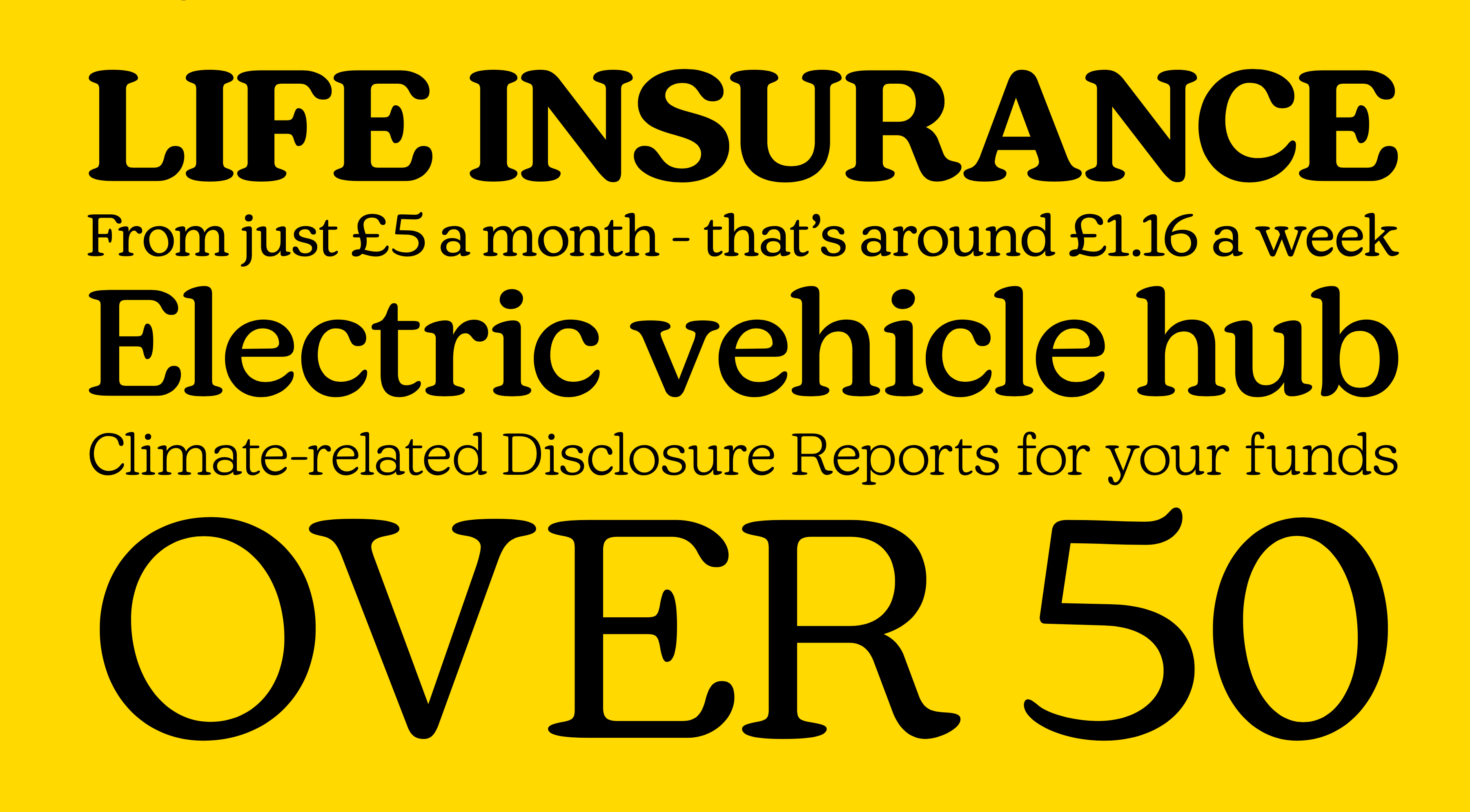
Bw 3Cat. Custom version of Bw Seido for Corporació Catalana de Mitjans Audiovisuals.
Let’s talk about the ever-controversial topic of font licenses. What led you to change your font licensing model?
It certainly wasn’t improvised. When I started more than ten years ago, I already tried a very similar model, with just four tiers (S, M, L, and XL), depending on the client’s size. It’s a fairer model, eliminating uncertainty and potential infringements. The problem back then was that I was competing against my own resellers and their traditional desktop, webfont, app,... licensing model. It didn’t make sense, so I had to adopt that traditional system, keeping the “all-in-one” as an additional license.
About 4 years ago we withdrew from Monotype and the rest of the resellers to sell exclusively through our own website. That’s when the process of rethinking the model truly began.
The vast majority of designers and end clients are honest, well-informed, and license what they intend to use. Unfortunately under the traditional model, we encountered many “abuses,” most due to ignorance, a few due to bad faith: desktop licenses used as webfonts, webfonts used in a logo... The traditional multi-license model leaves the door open to criminalising your clients, something I find appalling. By unifying all possible uses into a single license we eliminate many potential infringements.
On the other hand, we went back to the original idea from ten years ago of calculating the fees according to the size of the client. The larger a company is, the greater impact its marketing actions will have and the more value using fonts will bring to them. Therefore, the owner of the license must be the end client. Any company that outsources graphic design (the vast majority) simply has to share the fonts it has licensed with the agency or studio; there’s no problem, they are covered by the license.
How have you seen customer needs evolve in this regard? What are they looking for now that wasn’t as common before?
I don’t think much has changed. It’s true that the number of foundries opting for a similar model is growing, and that means some users are actively seeking this type of license, but the underlying needs remain the same; both designers and companies are looking for trust, peace of mind, and licenses that are easy to understand and easy to comply with. They don’t want to be measuring visits, downloads, or followers.
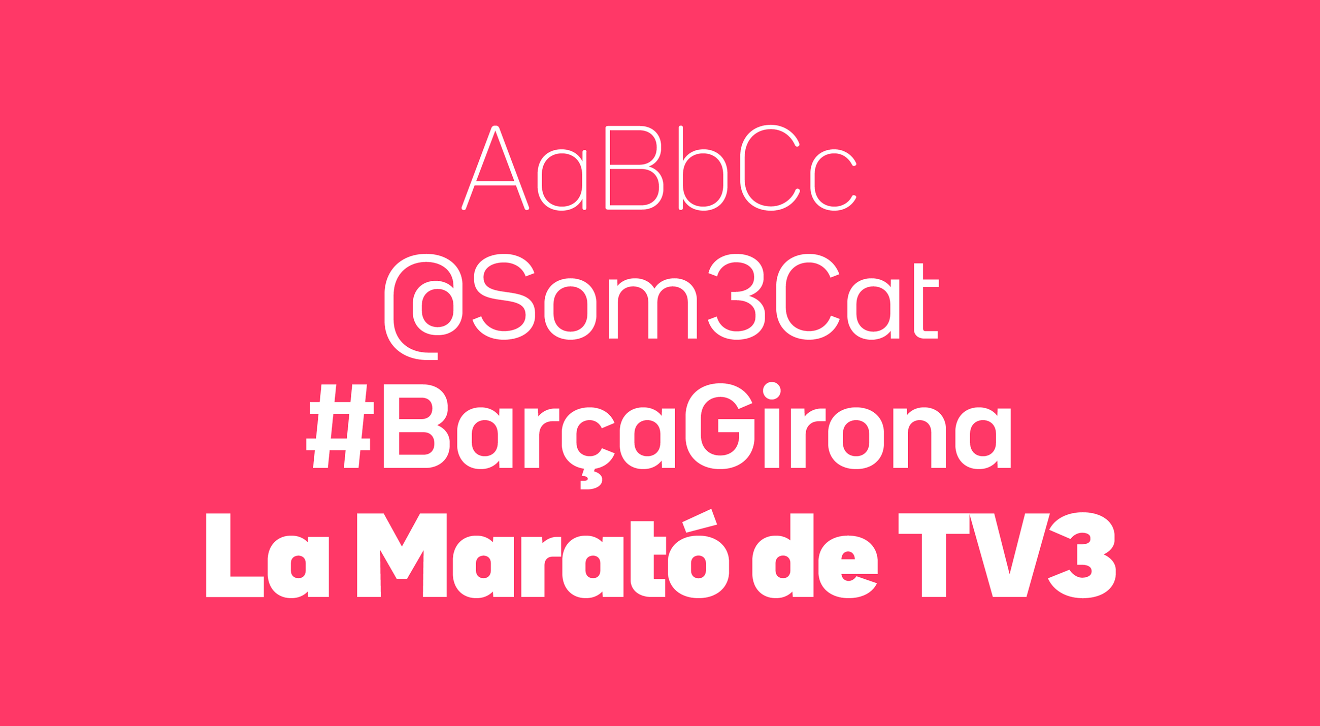
Champions Display. Custom typeface for UEFA Champions League. Agency: TwelfthMan.
How have you balanced accessibility and exclusivity with the new licensing model?
Exclusivity gets diluted as soon as you choose a typeface from a catalogue, whether it’s from Branding with Type or from any other foundry. If you want to ensure exclusivity, you’ll have to consider a custom design.
In terms of accessibility, we want everyone to try out the typefaces. Our entire catalog has been available for free under a Demo (trial) license for years now, and it remains that way. Anyone can download them to test them and present them to their clients. The Demo fonts are complete; they don’t have any missing characters, we didn’t “cripple” them; the only difference is the usage license.
It’s true that the new client-size model may exclude more sporadic uses. We’re studying ways to address those specific situations where the typeface is not part of the main brand identity. For example, an exhibition, a record cover, or a specific campaign. For now, we’ll address these cases individually offline, gathering feedback over the first few months.
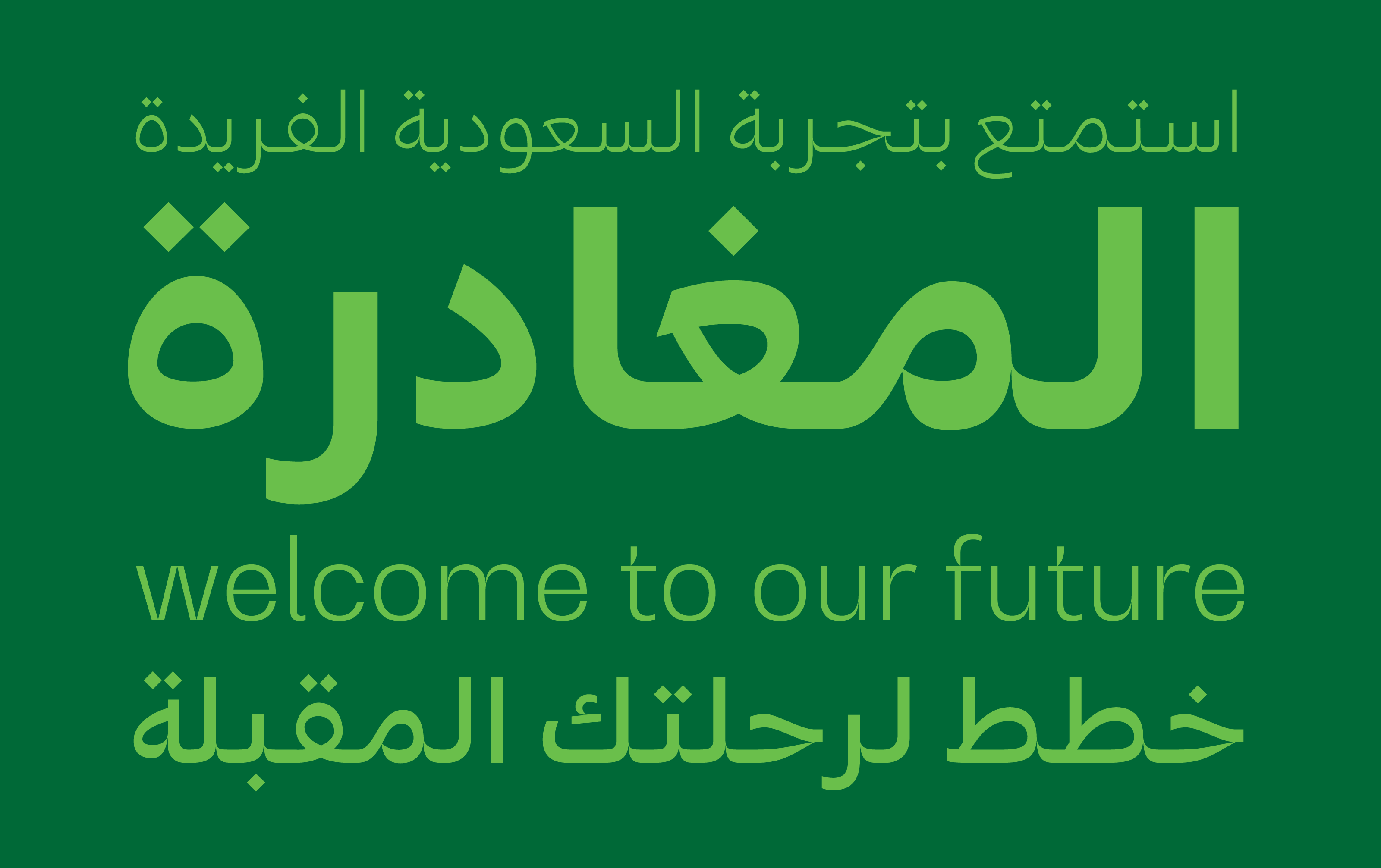
Saudia Sans. Custom version of Bw Gradual for Saudia Airlines. Agency: Landor. Arabic: Tarek Atrissi.
Let’s talk about the website. What motivated you to redesign it?
The old website worked fine, even though it was already almost a decade old. Over the years, many additions and modifications were made; in fact, the aesthetic changes to the new website are minimal. The change in licensing model was the main reason for the redesign, as it involved profound changes to the backend: we went from multiple licenses to a single one, the pricing tiers are new, and we now issue a license certificate unique to each end client, something not that common in the font industry. I’d like to take this opportunity to thank the De Ramos & Serch team for their patience and expertise with the new website.
What improvements have you made to the user experience and the way you present your fonts?
In order to present the fonts, we have taken the opportunity to introduce more testers and different color combinations. This way, designers can see how the fonts behave in both positive and negative at a glance, although it’s always best to download the demo and test the fonts directly in their designs.
The introduction of the license certificate greatly improves the lives of brand managers; it’s something they’ve been asking us for over the years. Typically, in the industry, licensor information appears only on the invoice, and this isn’t always practical.
Designing typefaces for clients like Manchester City, Saudia, and the Champions League are high-impact projects. What’s the work process like?
We always start with an initial prototyping stage, focusing on a few key characters that allow us to sketch quickly, with almost daily feedback, until we reach a point where everyone agrees. This stage lasts a couple of weeks at most and is crucial for defining the DNA of the design. Once the base is approved, revisions are spaced out over time, perhaps once per week, where we then review the remaining characters, symbols, punctuation...
Although sometimes the rest of the visual identity is very advanced and the typography is the icing on the cake, most of the time it’s developed in parallel. Throughout the process, we share beta versions with the client so they can test them directly in their designs. There are cases where a beta version has ended up being used in an urgent application that couldn’t wait to be released.
What’s common to all projects is very fluid communication between Branding with Type, the agency, and the client’s design team. These are long processes with many people involved.
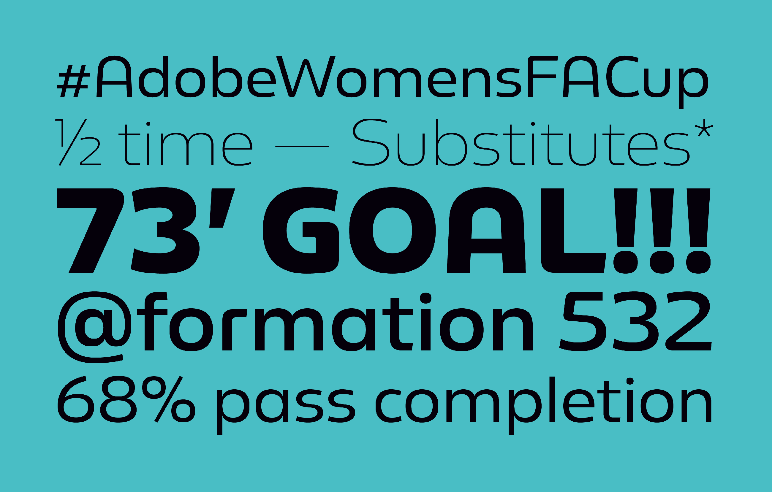
WFA Cup. Logo and bespoke typeface for Adobe Women’s FA Cup. Agency: TwelfthMan.
What have been the biggest challenges in terms of visual identity and functionality?
Limitations and constraints are good when it comes to design, so creating a typeface for a specific identity is easier than the blank canvas of a commercial typeface for the catalogue. Perhaps designing for a football club adds an extra layer of respect. Supporters are going to be way more critical than consumers of any other brand. Your design will be seen by many people with a very strong emotional bond to the brand. You try not to let it overwhelm you and do your job in the most professional way possible.
In any case, the biggest challenge is projects that require aligning the Latin alphabet with others that aren’t your own, such as Arabic or Chinese. It’s not just a strictly visual exercise; they’re different writing systems that respond to other traditions, other cultural contexts. That’s when I rely on colleagues who are specialists in those systems, and I trust their judgment. Right now, both challenges have come together: we are working on a Saudi football club which I can’t really talk about just yet. It’s a nice challenge to have.
How do you balance the creative vision with client requirements and technical needs?
Clients don’t usually ask us for impossible things and are quite receptive to understanding potential technical and/or technological constraints. That said, every project is about finding that ideal balance between what the client wants, what they really need, the timeframe, and the budget. It doesn’t matter how big or small the client is.
Any other aspects or projects you would like to highlight?
Yes, I would like to mention that I am honoured to be part of the jury for this year’s ADC Awards in the typography category. The deadline is February 28th, so you still have time to submit your projects here.
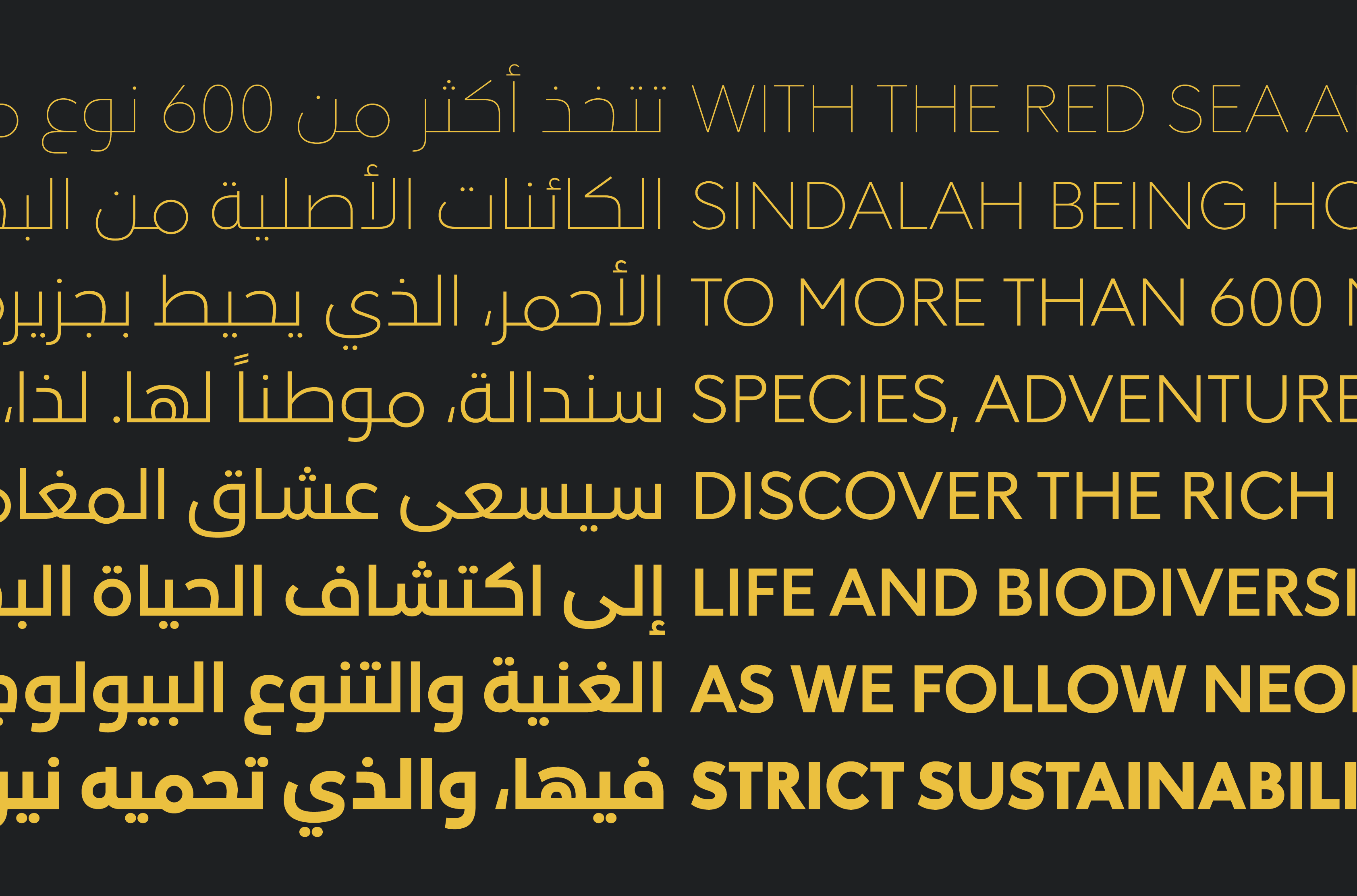
NEOM Sans. Bespoke typeface for NEOM. Agency: Landor. Arabic: Pilar Cano, Ferrán Milán & Nadine Chanine.