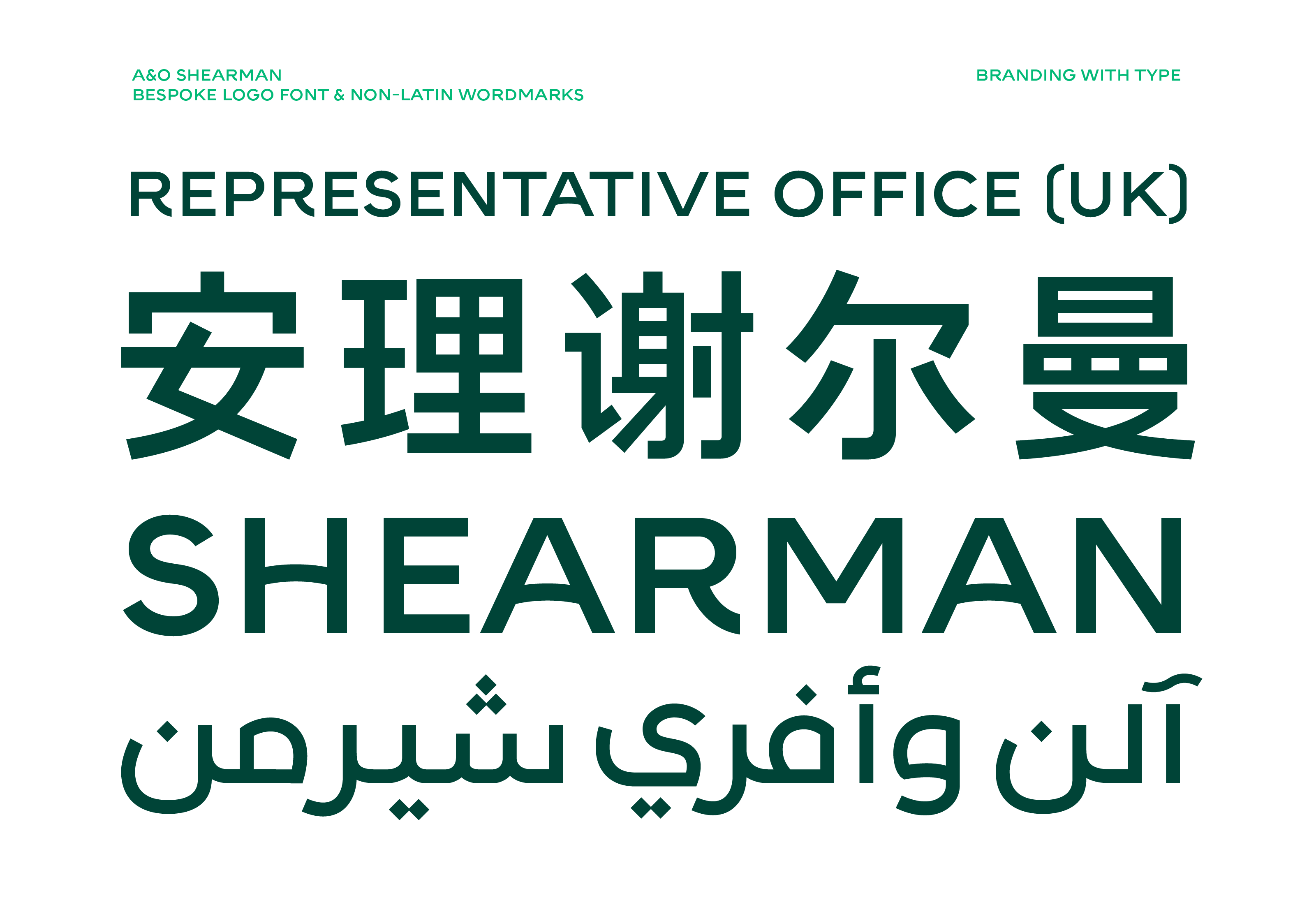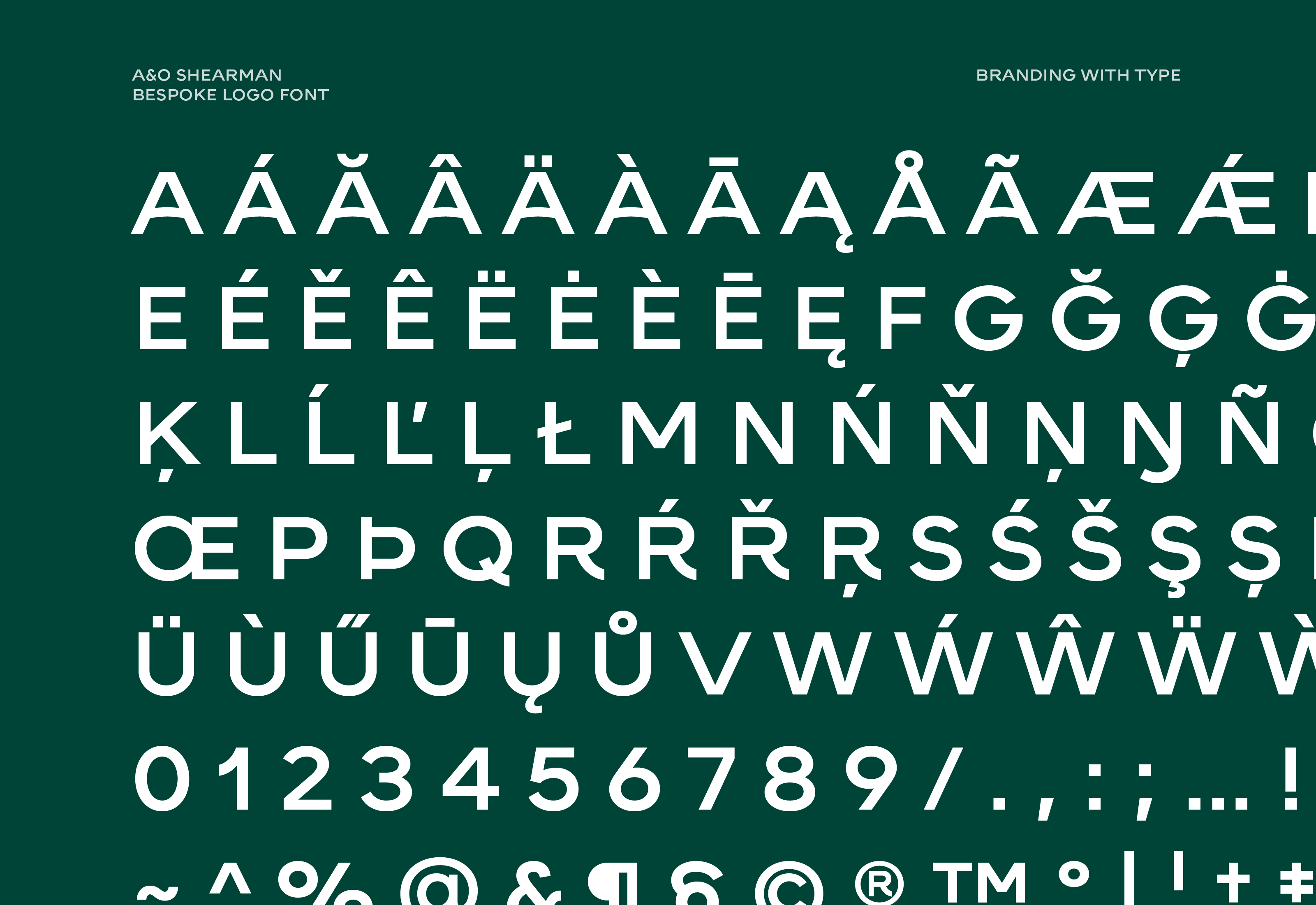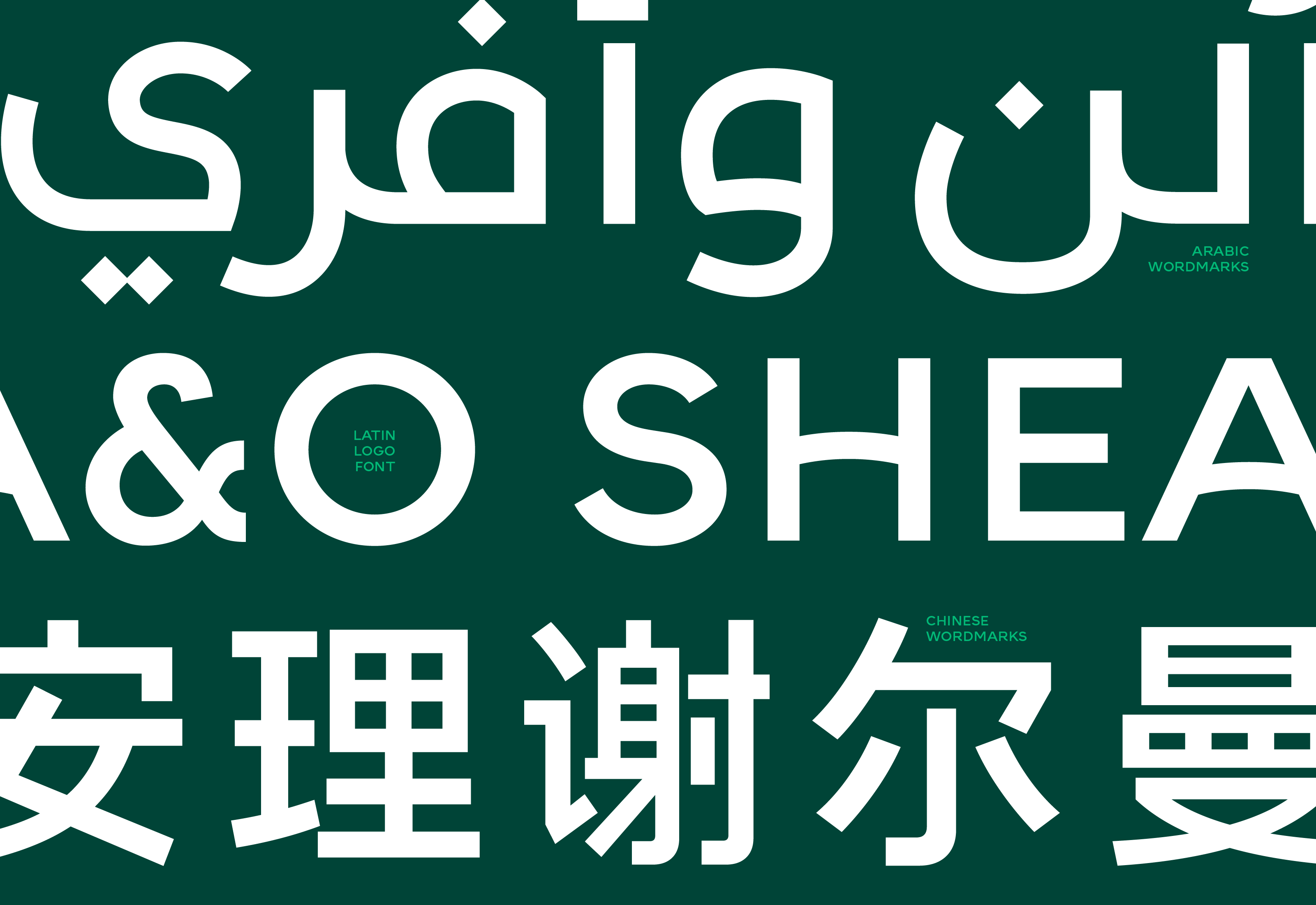
Bespoke typeface
A&O Shearman Logo Font
Quite often, an existing logo inspires the development of a bespoke font to carry its personality throughout the entire visual identity system: headlines, body copy, taglines,.. are visually linked to the wordmark. However, that's not always the case; sometimes the corporate typeface complements or even sharply contrasts with the wordmark.
Going a step further, sometimes a bespoke font is designed only for rendering the wordmark, not for deployment across the entire brand system. We could refer to them as Logo Fonts, but Wordmark Fonts or even Brand Architecture Fonts would be much more accurate terms.
They are particularly useful for companies with multiple divisions and/or sub brands, and also for businesses operating with different names in different countries. A Logo Font is a futureproof asset supporting the company's expansion and visual coherence.
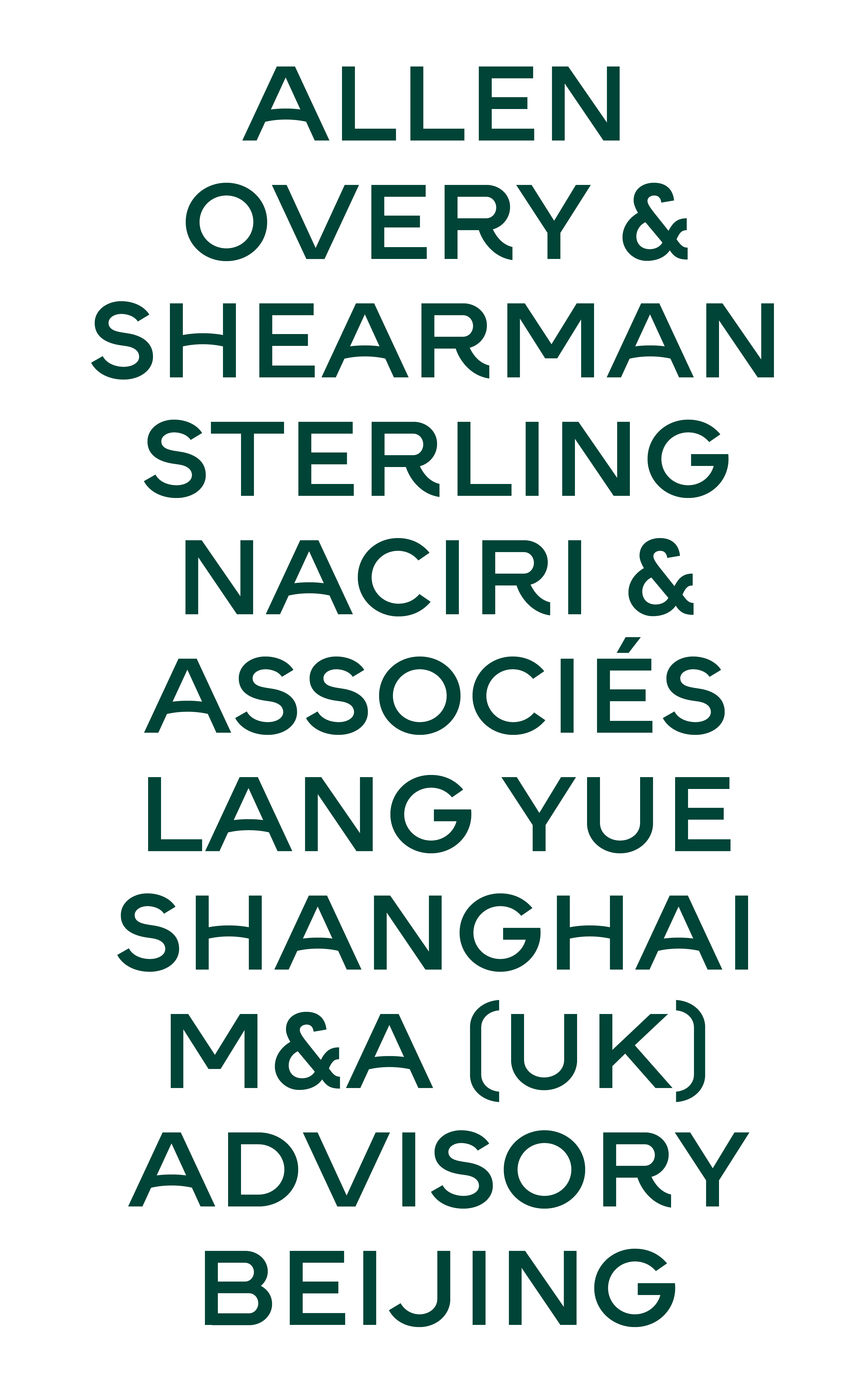
Logo Font for A&O Shearman
In 2024, the creative team at Landor tasked us with crafting a new wordmark for a very ambitious project they were developing. The scope and complexity of the new wordmark quickly evolved our task beyond the initial remit.
The client operates globally, with slightly different brand names depending on the specific location. We crafted wordmarks in Arabic, Chinese and Latin scripts, but the final solution became a full working Logo Font, not just a set of wordmarks.
Whether it's new partners or new offices in new locations, the bespoke logo typeface allows A&O Shearman to seamlessly maintain the visual coherence across all its brand architecture.