Miscelanea
A to Z business cards
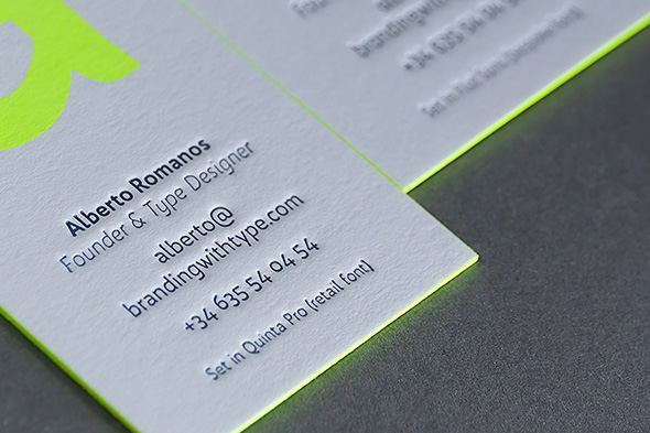
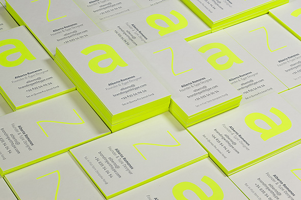
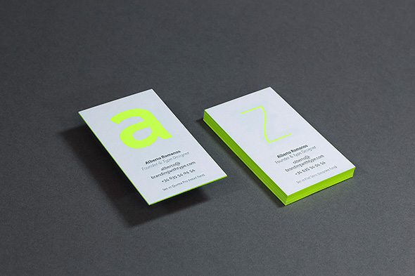
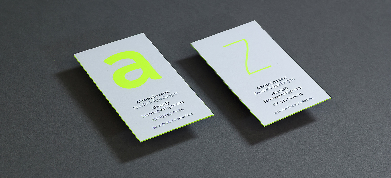
From the very beginning, it was clear for us that our business cards should showcase our fonts on the best possible way; we also wanted to represent the care and effort we put into each design, into each individual detail of every single glyph. The best way to symbolise that was by combining high quality paper with the craftsmanship of traditional printing methods.
It was also a great excuse to put Bw Quinta Pro and Flat Sans through the rigours of silkscreen and letterpress printing processes.
Here is the result. Now it’s time to continue working to fill the A to Z series with great font designs.