New font release
Bw Nista font family. A grotesque release
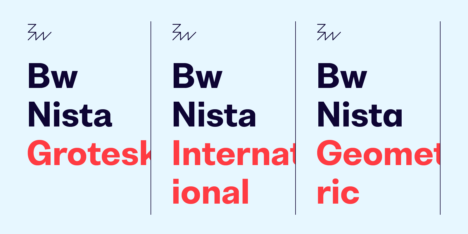
Bw Nista is a clean sans serif font family inspired by modernist design principles and aesthetics. It has been designed to provide a neutral tone of voice, with subtle features portraying different personalities across three clearly defined sets.
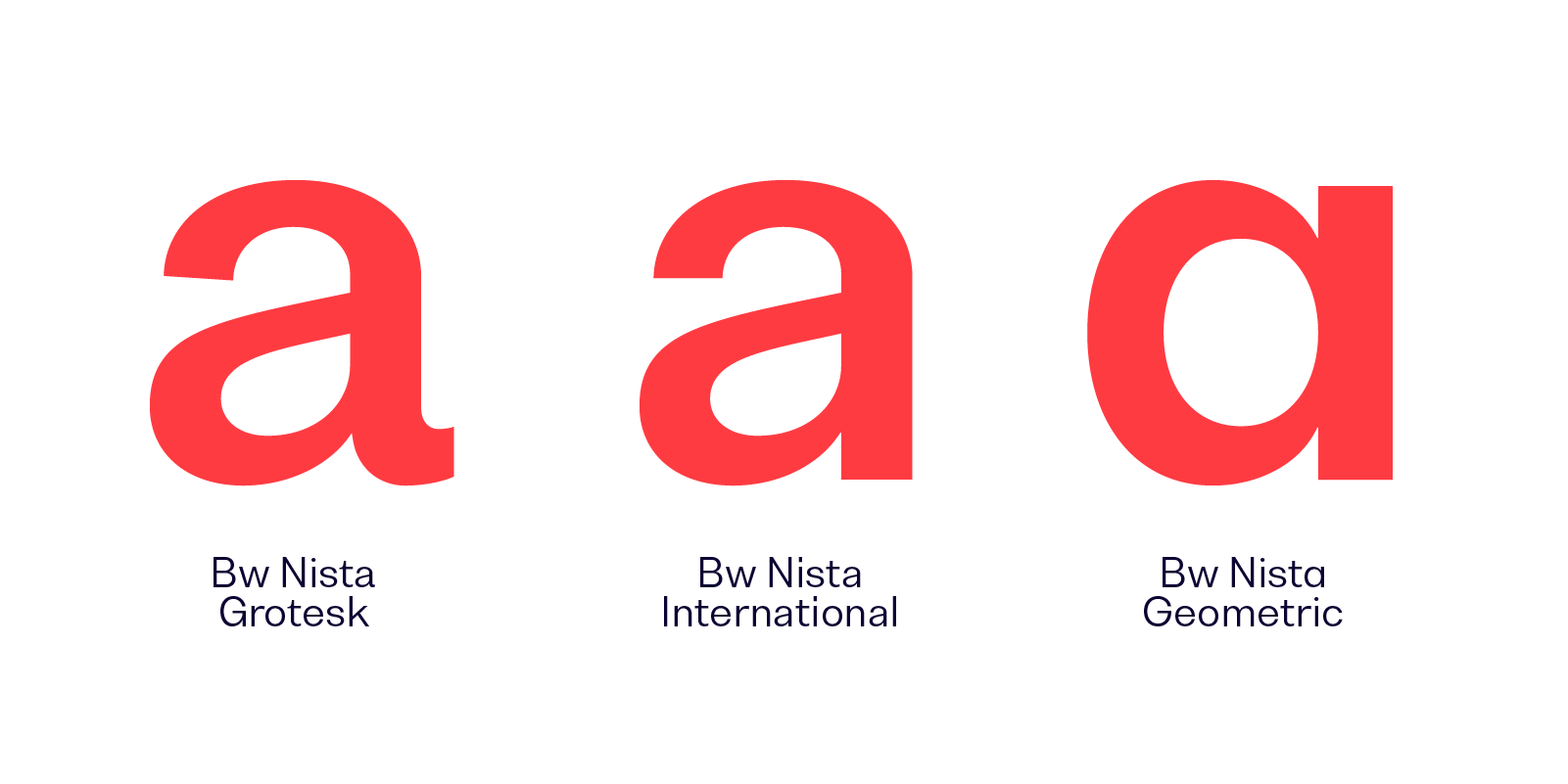
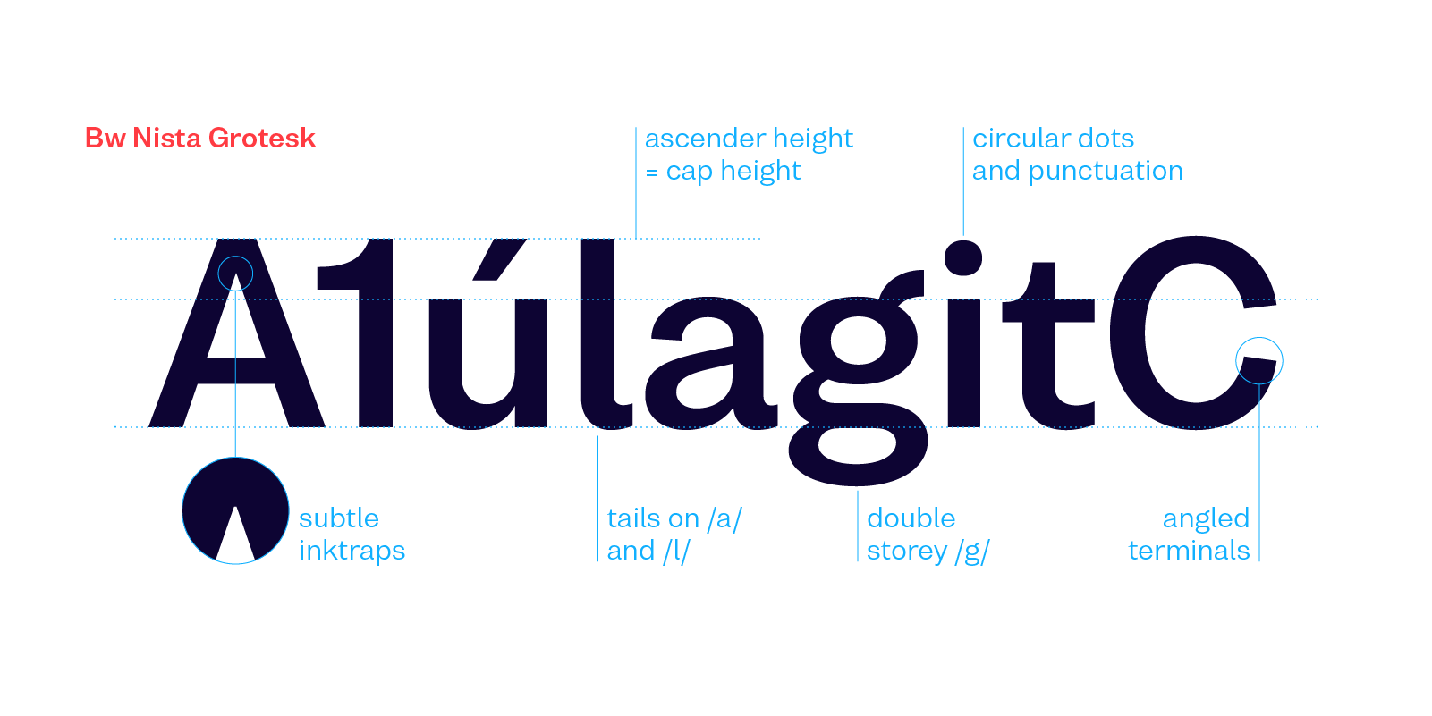
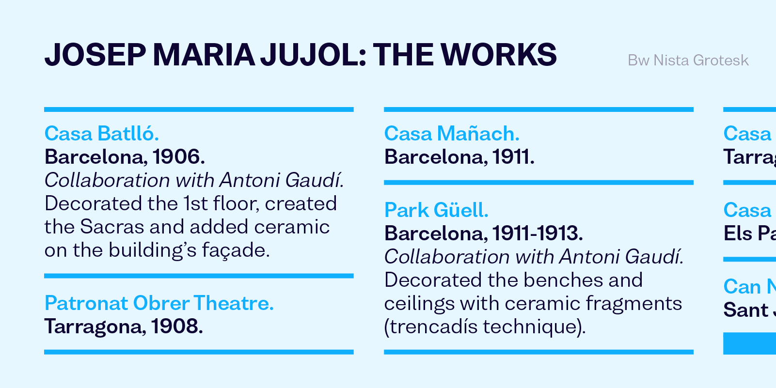
Bw Nista Grotesk’s clean shapes are peppered with subdued quirky details like rounded dots and punctuation, a double storey /g/, distinct design of /t/ or tails on /a/ and /l/, marrying the warmer feel of the early grotesques from the 19th Century with a contemporary approach.

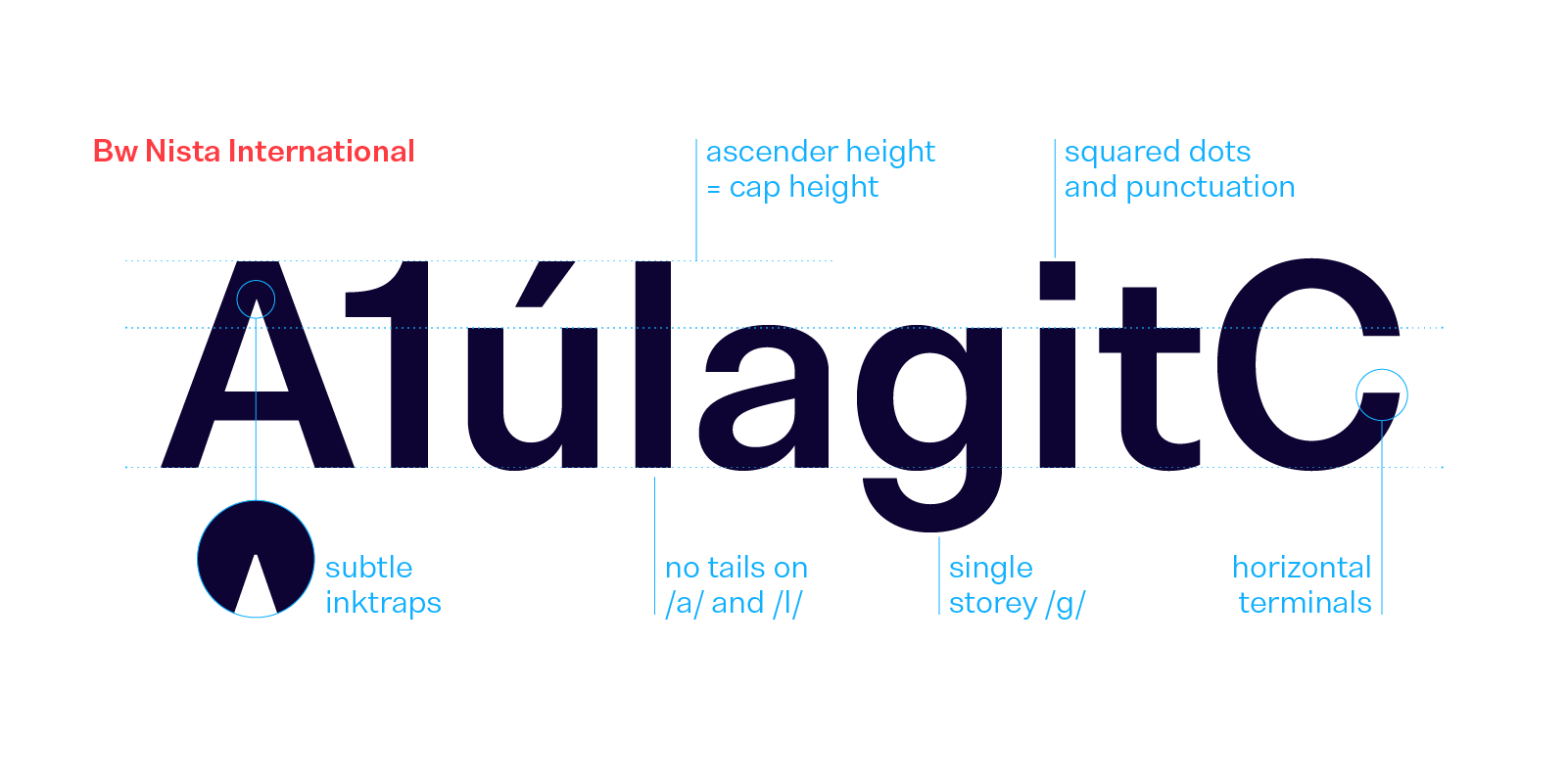
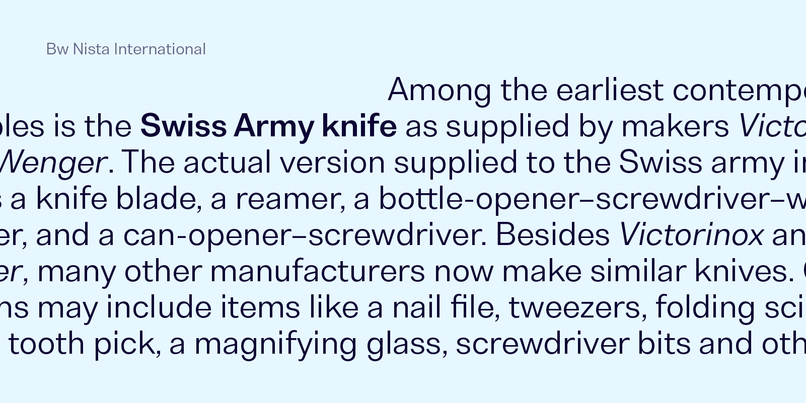
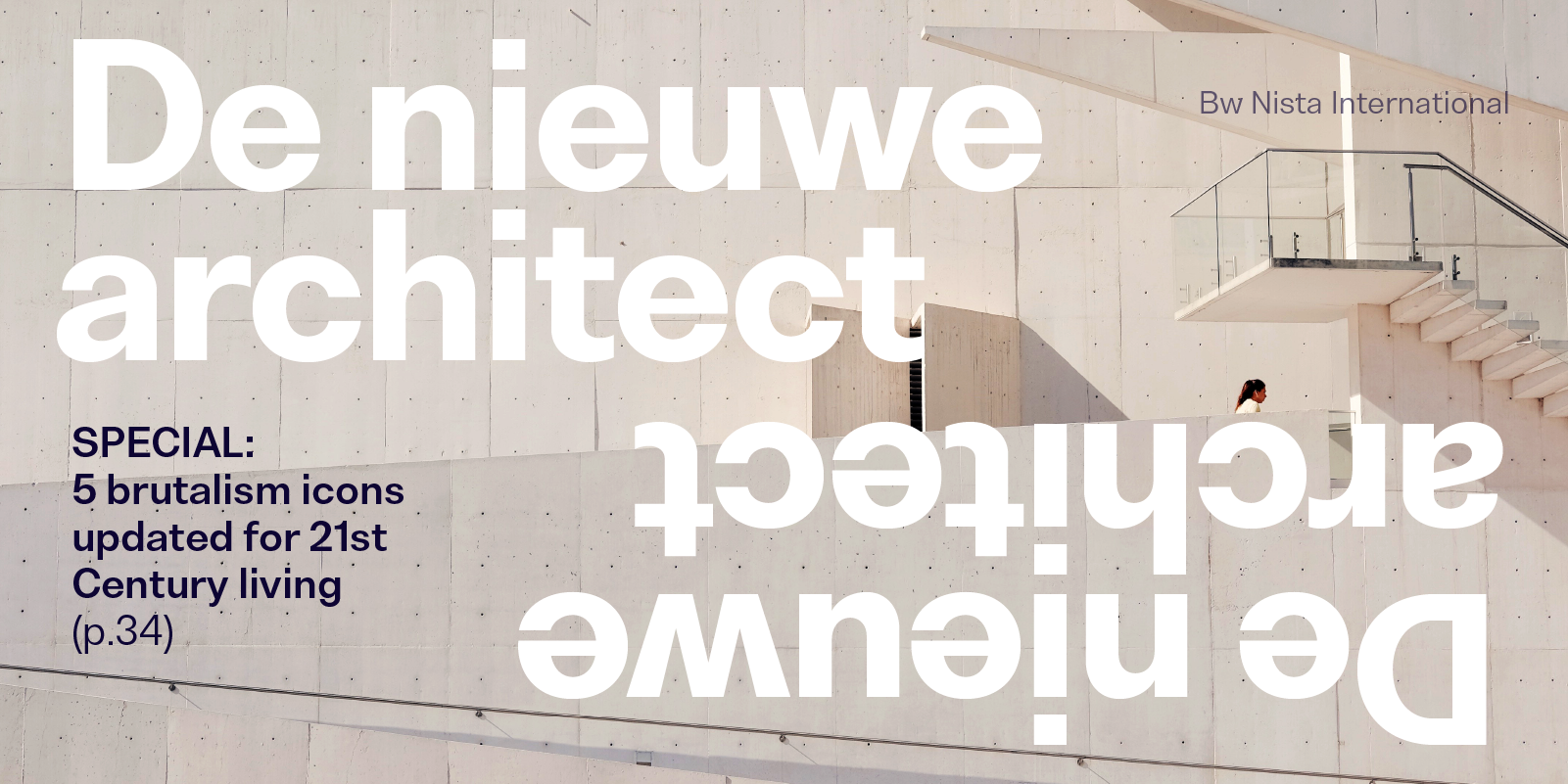
Bw Nista International taps into the utterly functional grid-based Swiss style thanks to its strict and rational shapes. As an exercise of constrain and precision, all terminals end either vertical or horizontally while removing all quirkiness of its Grotesk sibling.
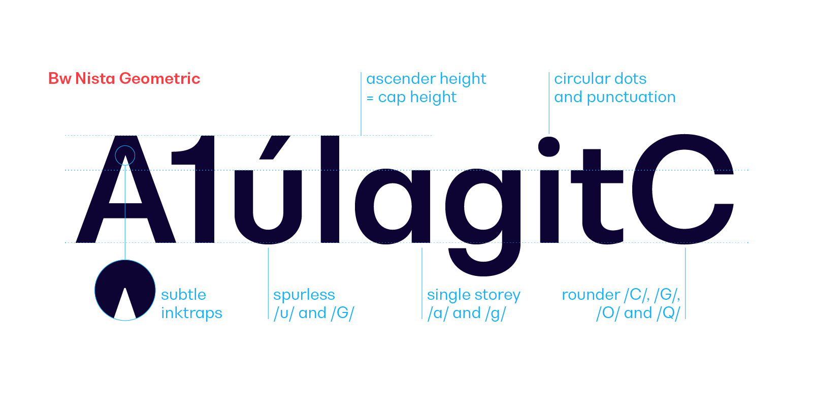
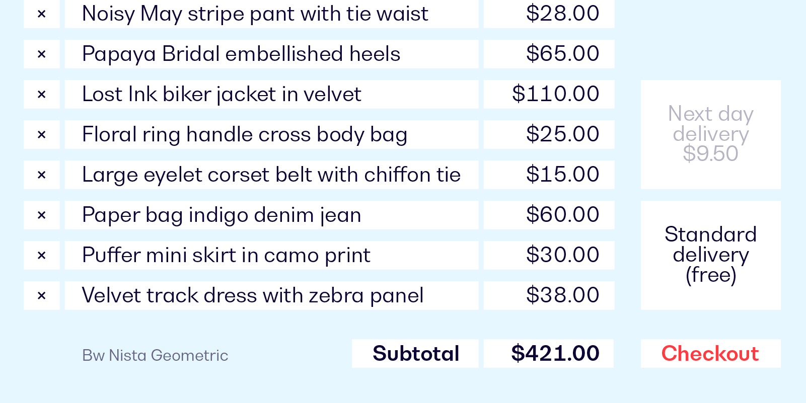
Bw Nista Geometric offers a more minimalistic interpretation of the genre, achieving an even simpler and cleaner feel. It borrows visual cues from the German geometric typefaces tradition, while maintaining the grotesque structure in line with its counterparts.

Designed by Alberto Romanos, all three variations are available in 7 weights from the elegant Thin to the authoritative Black with matching oblique italics, providing a very functional palette for the task at hand. It supports all European Latin languages and it includes OpenType features like ligatures, old style and tabular figures or case sensitive forms among others.
Try/Buy Bw Nista