Bw Helder
A A
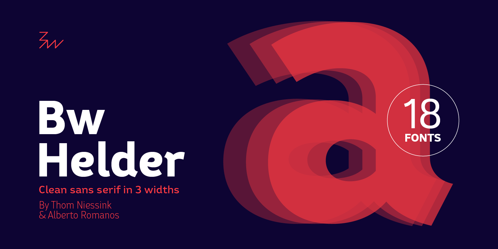
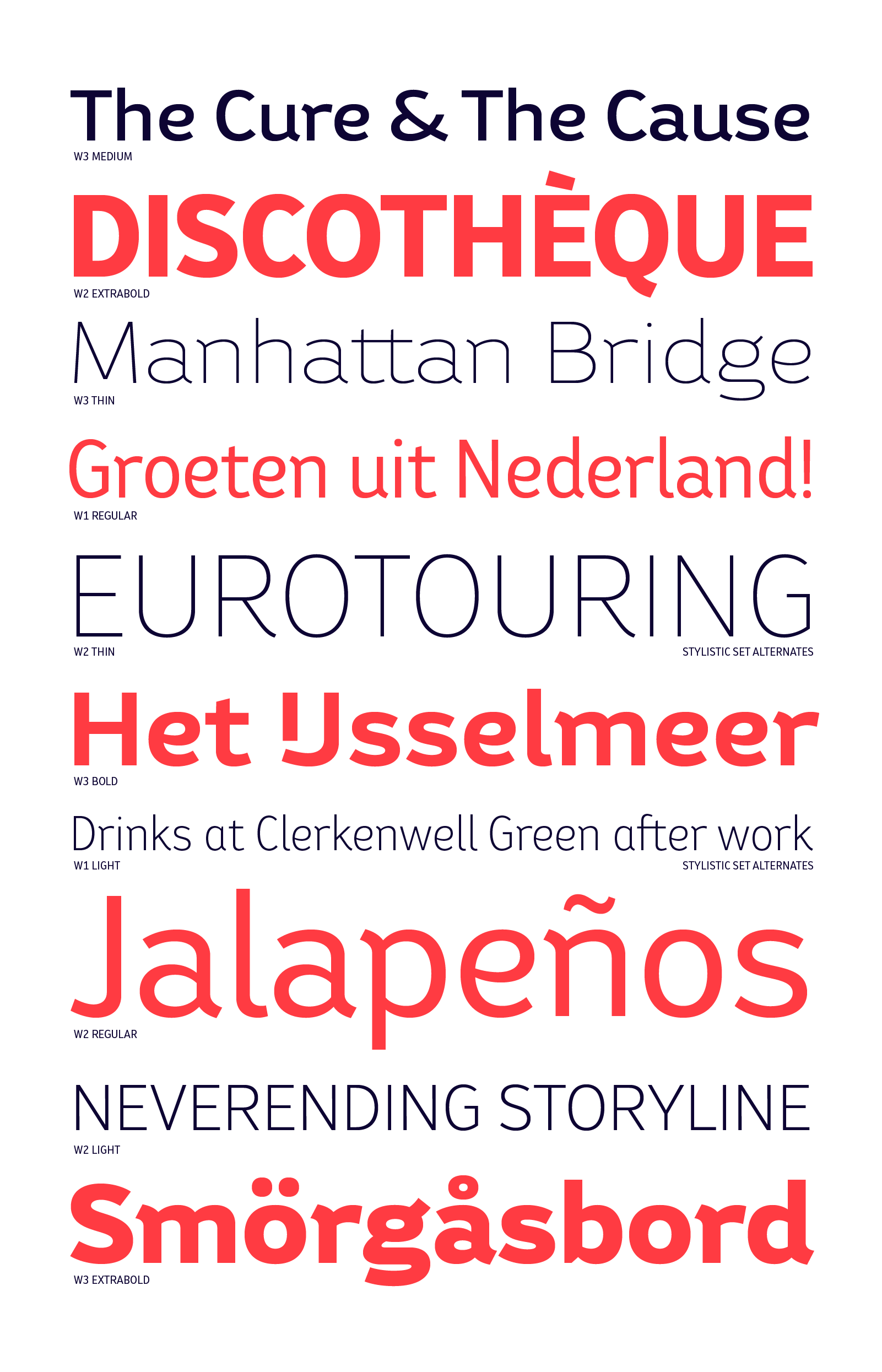
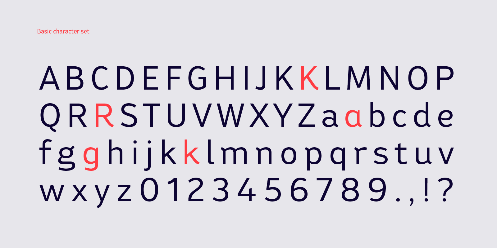
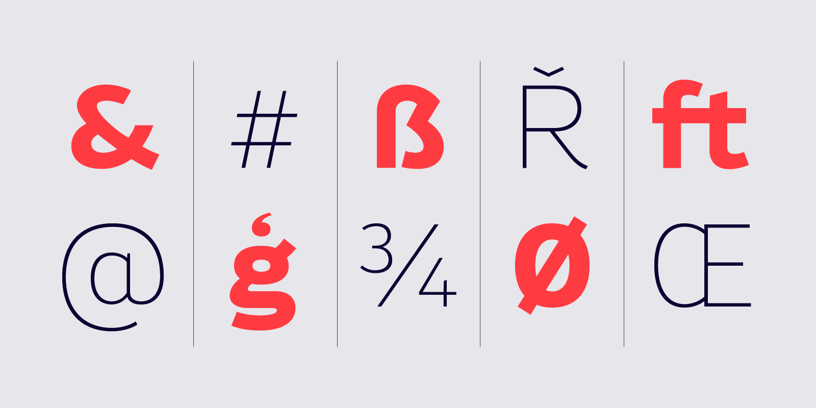
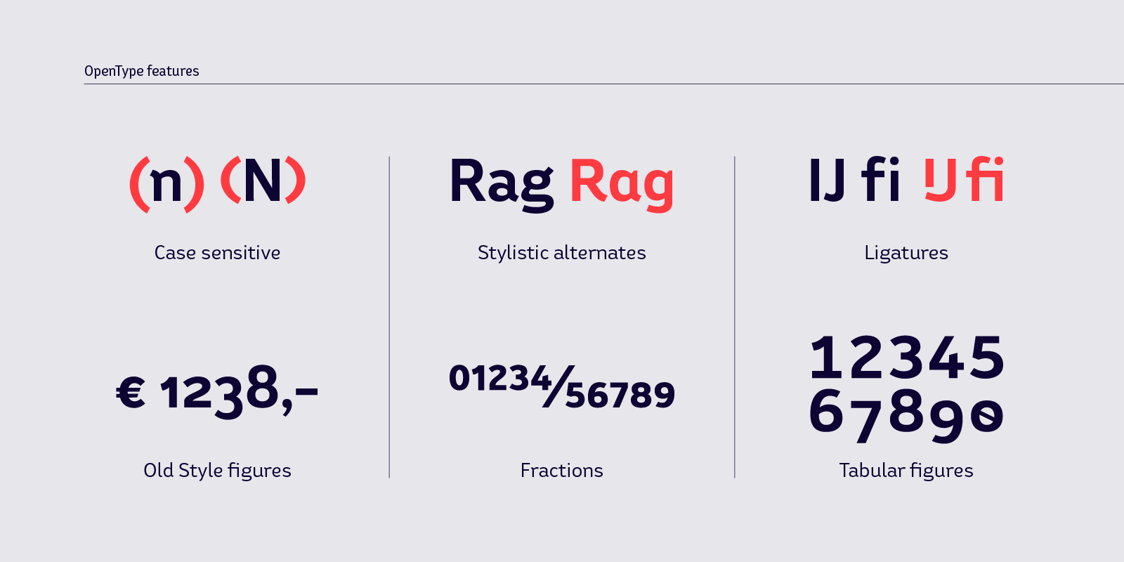
Bw Helder is a clean and versatile sans serif combining gentle subtleties on its curves with remarkable spurs branching off its stems.
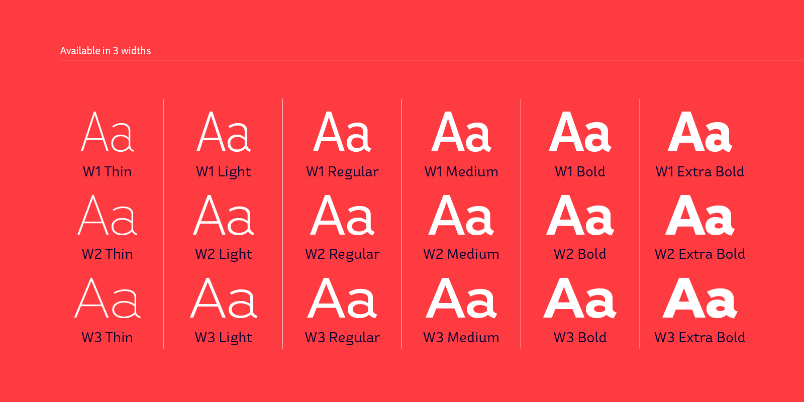
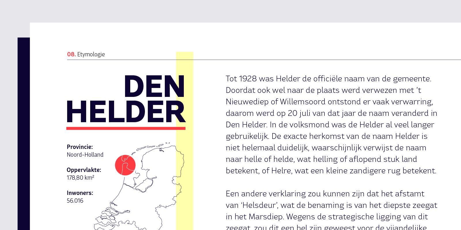
It instills a friendly yet professional tone of voice, while maintaining the composure when used in longer paragraphs at small sizes. Three different widths across six weights provide plenty of options and flexibility for the task at hand.
Designed by Thom Niessink & Alberto Romanos, Bw Helder is the first font on our library born out of the direct collaboration of two designers. This type family is inspired by an old piece of lettering Thom came across: The ornamental serifs featured on the original lettering have been tamed down attending to a functional criteria, conferring this type family its unique character without compromising its legibility.
